Introduction
In the ever-evolving world of interior design, new trends emerge to redefine spaces and aesthetics. One of the latest and most captivating trends is color drenching—a bold and immersive approach that embraces a single hue across an entire room, from walls and ceilings to furniture and decor. This technique creates a cohesive, dramatic, and visually striking effect, transforming interiors into seamless, monochromatic masterpieces. Whether aiming for a tranquil retreat or a vibrant, energetic space, color drenching offers endless possibilities to redefine the way we experience color in our homes.
Understanding Color Drenching
Color drenching is an advanced form of monochromatic design where a single shade dominates an entire room. Unlike traditional color schemes that incorporate complementary or contrasting colors, color drenching commits fully to one hue, using variations in tone, texture, and material to add depth and dimension.
This technique is not limited to just walls and ceilings but extends to furniture, cabinetry, moldings, and even soft furnishings like curtains and upholstery. The result is an immersive and harmonious environment that can be as soothing or dramatic as desired, depending on the chosen color.
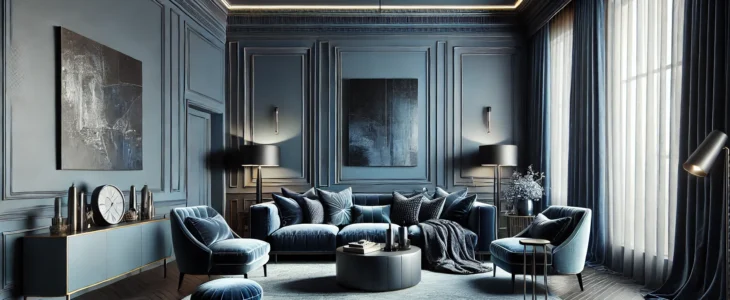
The Psychology of Color in Color Drenching
Since color has a profound impact on mood and perception, choosing the right hue is crucial when applying color drenching. Here’s how different colors can influence a space:
-
Deep Blues & Greens – Create a calming, serene atmosphere perfect for bedrooms and studies. These colors evoke feelings of relaxation and stability, making them ideal for areas of rest and focus.
-
Warm Terracottas & Ochres – Add warmth and coziness, ideal for living rooms and dining spaces. These earthy hues provide a grounded, inviting ambiance.
-
Bold Reds & Oranges – Inject energy and vibrancy, great for creative spaces or statement-making rooms. They stimulate enthusiasm and activity, making them excellent for workspaces or social areas.
-
Soft Pastels – Offer a gentle, airy feel, perfect for nurseries or relaxed living areas. Lighter shades can make a room feel spacious and refreshing.
-
Neutrals & Earth Tones – Maintain elegance and sophistication while keeping a subtle, grounded aesthetic. These colors are perfect for timeless, versatile designs that can be easily updated with accessories.
Choosing the right color depends on personal preference, lighting conditions, and the intended ambiance of the space.
How to Implement Color Drenching in Your Home
While color drenching may seem like a daring choice, its execution can be tailored to suit different tastes and styles. Here are some key steps to successfully applying this trend:
1. Choose Your Color Wisely
Select a hue that resonates with your style and complements the function of the room. Consider undertones, natural lighting, and how the color interacts with existing furniture and decor. Deep, moody shades can create an intimate, cocooning effect, while lighter hues can enhance openness and brightness.
2. Extend the Color Beyond Walls
To fully embrace color drenching, apply the chosen hue to ceilings, trim, doors, cabinetry, and even furniture. This approach eliminates harsh visual breaks, creating a smooth and immersive look.
3. Use Different Finishes and Textures
To avoid a flat, one-dimensional look, mix finishes and materials. Matte walls paired with glossy furniture or velvet drapes against wooden paneling can add richness and depth to the space. Consider layering different fabrics such as linen, wool, or silk to introduce visual interest.
4. Incorporate Layering and Contrast
While the focus remains on a single color, slight variations in tone can introduce contrast. For instance, layering a slightly darker or lighter shade on architectural features or soft furnishings can enhance visual interest. Monochromatic patterns or subtle geometric designs in the same color family can add a touch of sophistication.
5. Balance with Lighting
Proper lighting is essential in a color-drenched room. Natural light enhances depth, while artificial lighting can be strategically used to highlight different tones and textures. Warm or cool lighting can also shift the perception of the chosen hue. Accent lighting, such as wall sconces or LED strips, can help highlight architectural details and maintain the depth of the space.
6. Accessorize Thoughtfully
To maintain a cohesive look, opt for accessories in similar shades or neutral accents that don’t disrupt the color flow. Metallic or glass elements can add a touch of contrast without overpowering the monochrome effect. Incorporating organic materials such as wood, stone, or plants can bring warmth and balance to the space.
The Benefits of Color Drenching
Color drenching isn’t just an aesthetic choice; it offers several advantages in interior design:
-
Creates a Cohesive Look – The absence of contrasting colors leads to a unified, visually expansive space.
-
Adds a Sense of Drama – A fully saturated room can make a bold, artistic statement and leave a lasting impression.
-
Enhances Mood and Atmosphere – The chosen color sets the tone, whether calming, energizing, or luxurious.
-
Maximizes Small Spaces – By eliminating visual breaks, color drenching can make compact rooms feel larger and more harmonious.
-
Encourages Creative Experimentation – This technique allows homeowners to fully embrace and personalize their color choices without relying on multiple hues.
Common Mistakes to Avoid
While color drenching is a powerful design tool, improper execution can lead to overwhelming or unbalanced results. Here are some pitfalls to steer clear of:
-
Choosing an Overwhelming Hue – Extremely dark or bright colors can become overpowering if not balanced with texture and lighting.
-
Neglecting Texture and Finish – A single color without variations in finish can appear flat and uninspired.
-
Ignoring Natural Light – The way a color appears under artificial and natural light should be considered before full application.
-
Forgetting to Test Samples – Always test paint swatches in different lighting conditions before committing. Sampling on multiple surfaces (walls, ceilings, and furniture) ensures that the hue maintains its intended effect.
Color Drenching in Different Spaces
The adaptability of color drenching allows it to be applied in various settings:
-
Living Rooms: Rich jewel tones like emerald green or deep navy add a luxurious feel and can be paired with statement art pieces.
-
Bedrooms: Soft, muted tones like lavender or sage create a peaceful retreat, ideal for relaxation and better sleep.
-
Kitchens: Earthy tones like deep terracotta or olive green can make the space warm and inviting while remaining timeless.
-
Bathrooms: Monochromatic blues or greys provide a spa-like ambiance, making morning routines more refreshing.
-
Home Offices: Deep teal or warm neutrals enhance focus and productivity, reducing distractions and promoting efficiency.
Conclusion
Color drenching is a revolutionary design trend that allows for bold, immersive, and cohesive interiors. By thoughtfully selecting a hue, incorporating textures, and balancing lighting, homeowners can create spaces that are both visually striking and emotionally resonant. Whether seeking a sophisticated, minimalist aesthetic or a vibrant, artistic statement, color drenching opens up new possibilities for personal expression in home design. With the right approach, this trend can transform any space into a breathtaking monochromatic sanctuary, proving that a single color, when used correctly, can be both powerful and transformative.
lorenest.com | Knowledge You Need, At Your Fingertips